Toronto-based Brand Designer & Creative Director
Brand design & website design systems
Neurative
Renaming and rebuilding an AI SEO platform
They came to me mid-rename. The company was called SnapSEO, which made them sound like a quick fix for keyword rankings when what they'd actually built was an AI agent doing the strategic work of a whole SEO team. The old name was capping how seriously people took them.
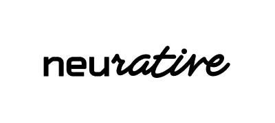
The new one, Neurative, holds both halves of the story at once, the neural and the narrative, the machine and the human it's writing for. That gave us the brief. We started with the logo, looking for a mark that sits right at that intersection instead of picking a side, and once that landed it set the tone for everything after it: type, colour, the visual language, and the website that put it all in front of customers.


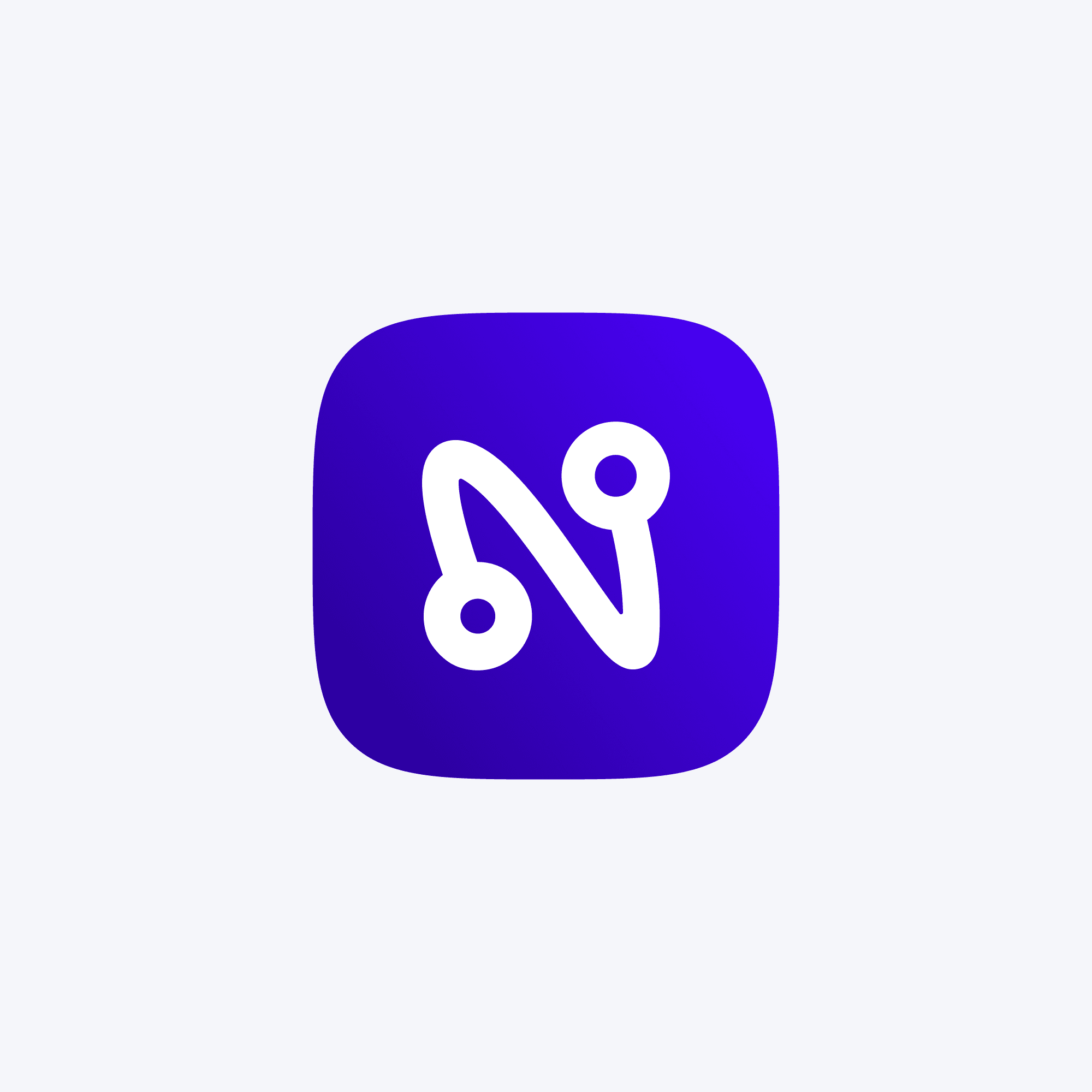
The icon had to do the same job on its own, without the wordmark there to explain it. What we landed on is an "N" built from two nodes tied together by a single hand drawn line. The nodes are the machine, the network, the part that processes. The line is the human, drawn rather than plotted, and deliberately imperfect against the geometry around it. You need both halves for the letter to work, which is the point.


From there the same tension carries the rest of the system. The visual language layers structured grids, data-like frameworks, and blueprint style lines against hand drawn marks, annotations, and loose sketches, so almost every piece has both a built side and a drawn side to it. It's a flexible way to work. The same rules cover a product screenshot, a diagram, and a piece of social, and everything still reads as the same brand. More importantly it gives the team a way to look technical without looking cold, which is the balance the whole company is trying to strike. They're narrative architects, and the design language says so before anyone reads a word.