Branding & creative direction
Profit Mill
Building a brand from scratch
When the founder, Peter came to me, Profit Mill was a name and a strong opinion. He'd spent eight years inside Google and was starting his own B2B paid ads agency on a simple belief: clients should be paying for profit, not clicks. My job was to give that belief a face, in a category where most agencies look and sound like the same agency.
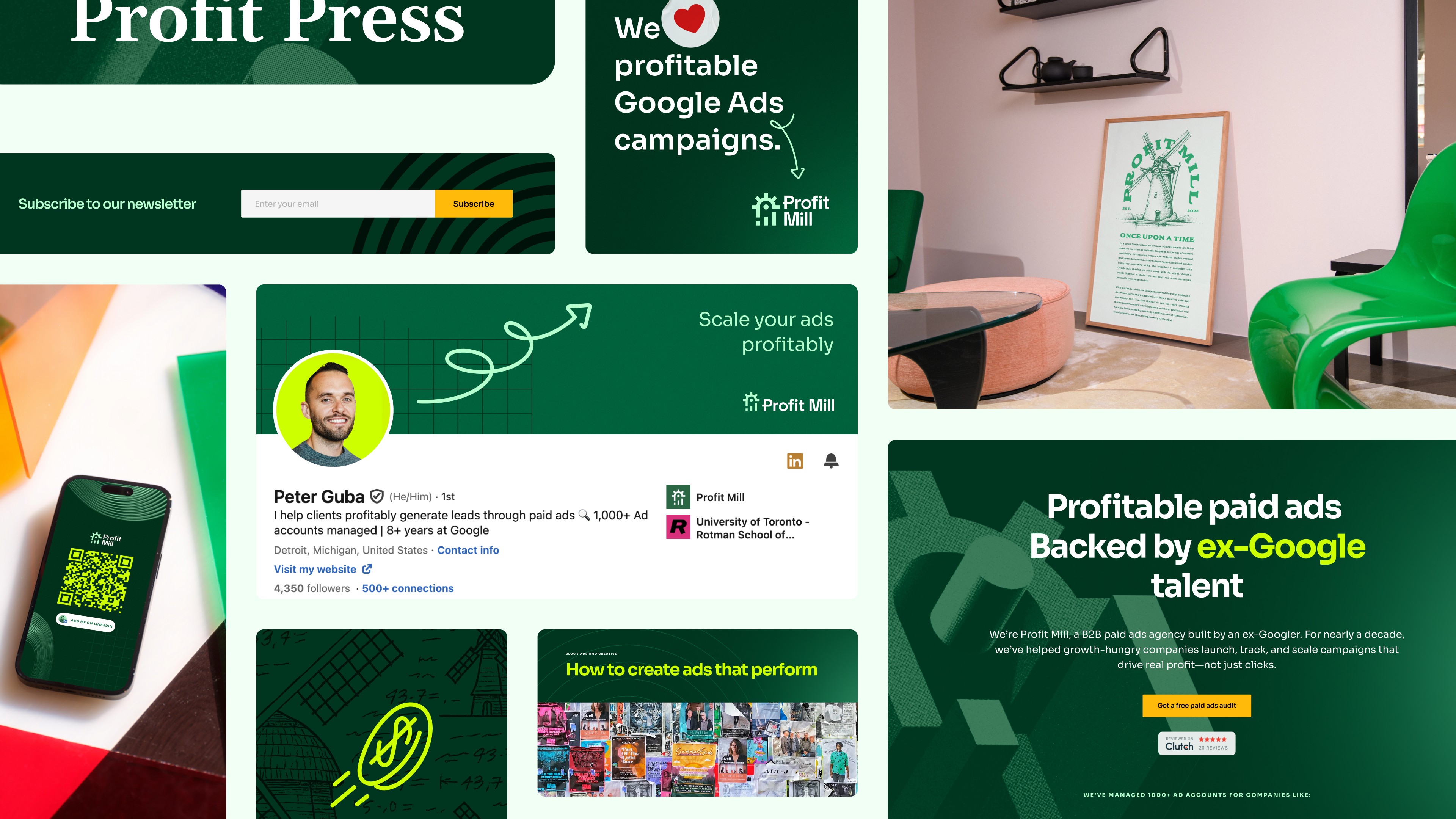
So we started at the very beginning. Rough logo sketches, then the mark itself, then everything that had to live around it: type, colour, layout, iconography, and the rules that keep it all together across the site, decks, reporting, and social. What began as a blank page is now a brand the team designs against every day.


Where we landed is an icon that turns, the way a mill does, with the forms stepping upward so the movement reads as growth rather than just rotation, and a "P" and an "M" tucked into the negative space for anyone who looks twice.


The palette runs on greens, which is the obvious read for growth and also the right one for an agency whose whole pitch is profit over vanity metrics. The more useful decision was the art. The icon is constructed on three grids, square, angled, and circular, and rather than leave those behind once the mark was finished, we kept them as the drawing tools for everything else. Patterns, illustration, backgrounds, section dividers, all of it gets built from the same three grids the logo came from. It means new work never has to be invented from scratch, and everything the team makes traces back to the mark whether or not the mark is in the frame.